The Brief


Ditch The Label is a global youth charity dedicated to helping young people navigate issues surrounding mental health, relationships, bullying, and personal identity by offering a digital safe space of guidance and support. All of this is available on their AI-powered site. We were tasked with creating two distinct 60-second videos for the charity. One was to advertise their new cutting-edge Web 3 site, Ditch the Label 3.0. The other was an emotive campaign for young people living in Mexico, raising awareness of the online support available from Ditch the Label via young people’s mobile phones.

Our Response


We created two highly engaging mental health animation videos to drive awareness for the youth charity and demonstrate the positive impact Ditch the Label has on countless young people around the world. Having previously worked with the charity in 2022 for another exciting campaign, we wanted to build upon our previous work with a fresh, bold take to push the creative boundaries even further than before.

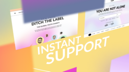
Ditch the Label’s Web 3 site


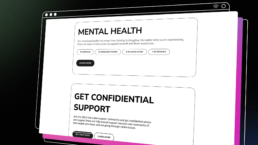
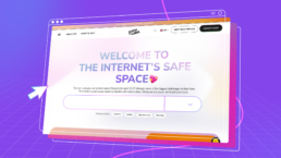
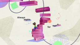
For the first mental health animation video, we needed to convey the charity’s message in a way that was fun, engaging, and easy to understand. Explaining Ditch the Label’s Web 3 site and what it can offer young people in just 60 seconds was no easy feat. Inspired by the latest 2D design trends, we created an animated explainer video that was current, relatable and easily digestible for its younger audience.

We pulled inspiration from gradient and texture-led designs, incorporating geometric shapes, slick motion graphics and Y2K elements to create a young and dynamic feel to the charity animation. The fast transitions and lively motion graphics were chosen to grab a teenage viewer’s attention and keep them hooked until the end, all while explaining Ditch the Labels 3.0’s useful online features and support they provide young people in just a few clicks. 

The role of the phone for Mexican youth   


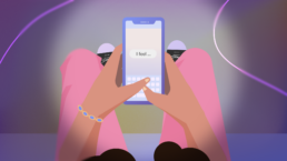
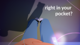
For the second video, we created a 2D mental health animation video that was more cinematic in style. The animation begins with a Mexican teenage girl struggling with issues of anxiety and loneliness. We used dark colours, smoke-like text effects and oversized shadows to evoke a sense of unease and fear that many young people may experience when dealing with mental health issues. 

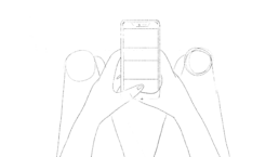
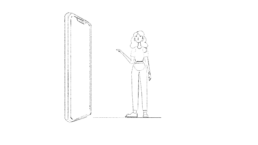
The story then transitions to a more positive note with bright, vibrant colours inspired by Ditch the Label’s youthful branding and colour themes as the teenage character uses her phone to obtain the support she needs.

Character development


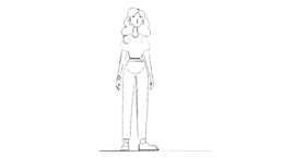
This central character was key to informing the narrative and creating the emotional core of the mental health animation video. The video had to feel authentic and connect with its audience, so the development of a Mexican teenage girl character to resonate with viewers was imperative. 

We asked Ditch the Label to give us some insight into the most pressing issues affecting young people in Mexico, and this is how the story began to take shape. Addressing themes of anxiety, loneliness, and bullying, our goal was to ensure that the character animation and story resonated deeply with its target audience. 

We also did our own research into young people’s trends and fashion in Mexico to inform our character design and make the teenage character feel as relatable as possible to the audience. Despite the challenging themes, we wanted viewers to identify with the situations portrayed, creating a positive and uplifting message that perfectly encapsulated Ditch The Label’s mission of supporting and empowering young people around the world through their digital safe space. 

Breakdown


Early devlopment


Social Snippets


Being aimed at a Gen Z audience, the animation had to be able to be easily repurposed into social media content. The 60-second animations were made into six short social media clips to be shared across platforms to maximise the reach and overall impact of the two videos for the charity.

An Impactful Result


This mental health animation video, helping young people who may be struggling to get the help they need, was an extremely rewarding project to be a part of. We created two highly engaging and impactful videos that were both highly relatable and engaging to their Gen Z audience.

The two 60-second videos serve as a valuable resource for young people in accessing the support and advice they need through Ditch the Label’s exceptional online resources. They act as a digital safe space for young people and we are incredibly proud to work alongside them in helping such a fantastic cause. 

What our client Said


“Producing our first ever animated video was a scary proposition and uncharted territory for us as an agency. Working with The Animation Guys they put us at ease, listened to our ideas and made the process come to life. They’re genuinely decent, honest and hard-working people that ultimately produce first-class animation videos. We couldn’t be happier with our final product and no doubt will return to them for a follow up video at some point! Fully recommend.”

Beth Hellowell

Managing Partner @ Signify Digital

Want your project to walk the walk?Let’s talk the talk.

Get in Touch

Start your 3D animation project.

Find out more