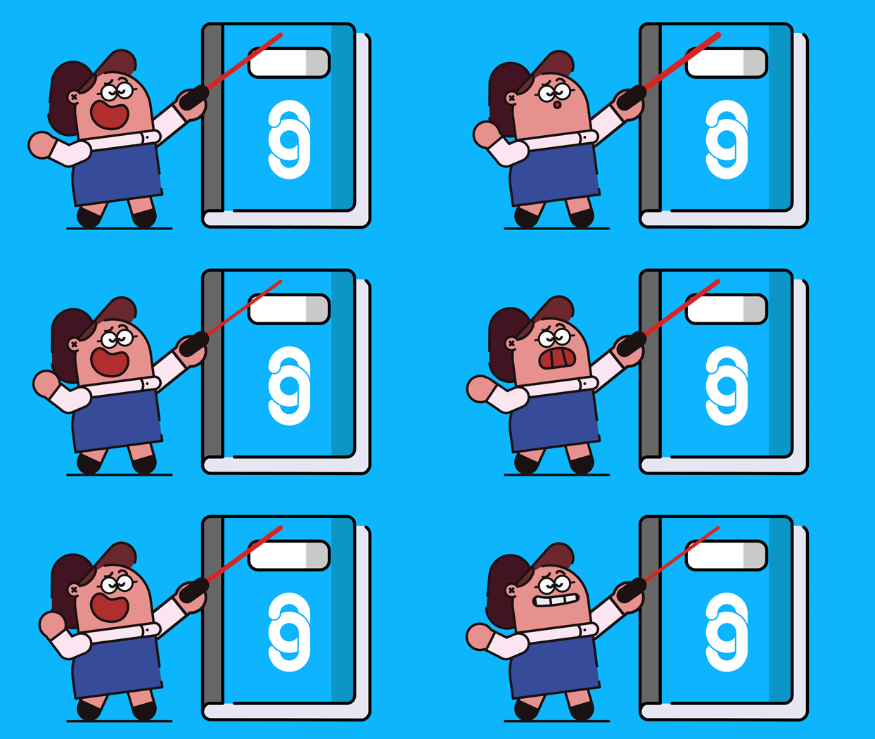
A bright & fun explainer animation for Signify Digital, a highly personable online marketing agency that provide a variety of digital marketing services for organisations both large and small.
The Brief
Signify Digital needed a short animation that would explain to their audience more about their services, approach and what makes Signify unique. As a healthcare marketing agency with a bright colour palette and fun approachable style to their company and business branding, we created an explainer video that did all that in under 60 seconds.
Our Response
Style Development
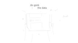
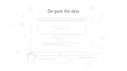
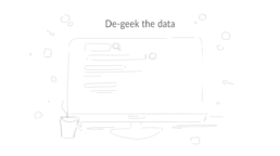
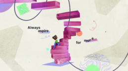
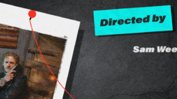
We knew from the outset we wanted the animation to have a balance of visual imagery. Not too curved and soft, not to straight and sharp. With Signify’s bright and clean branding colour palette and extended media we knew that there was a lot we could do with it. Through initial sketch developments of a variety of ideas, we landed on the two images on the right that were brought to Signify as Style Frames.
Visualisations
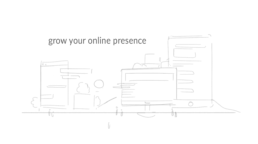
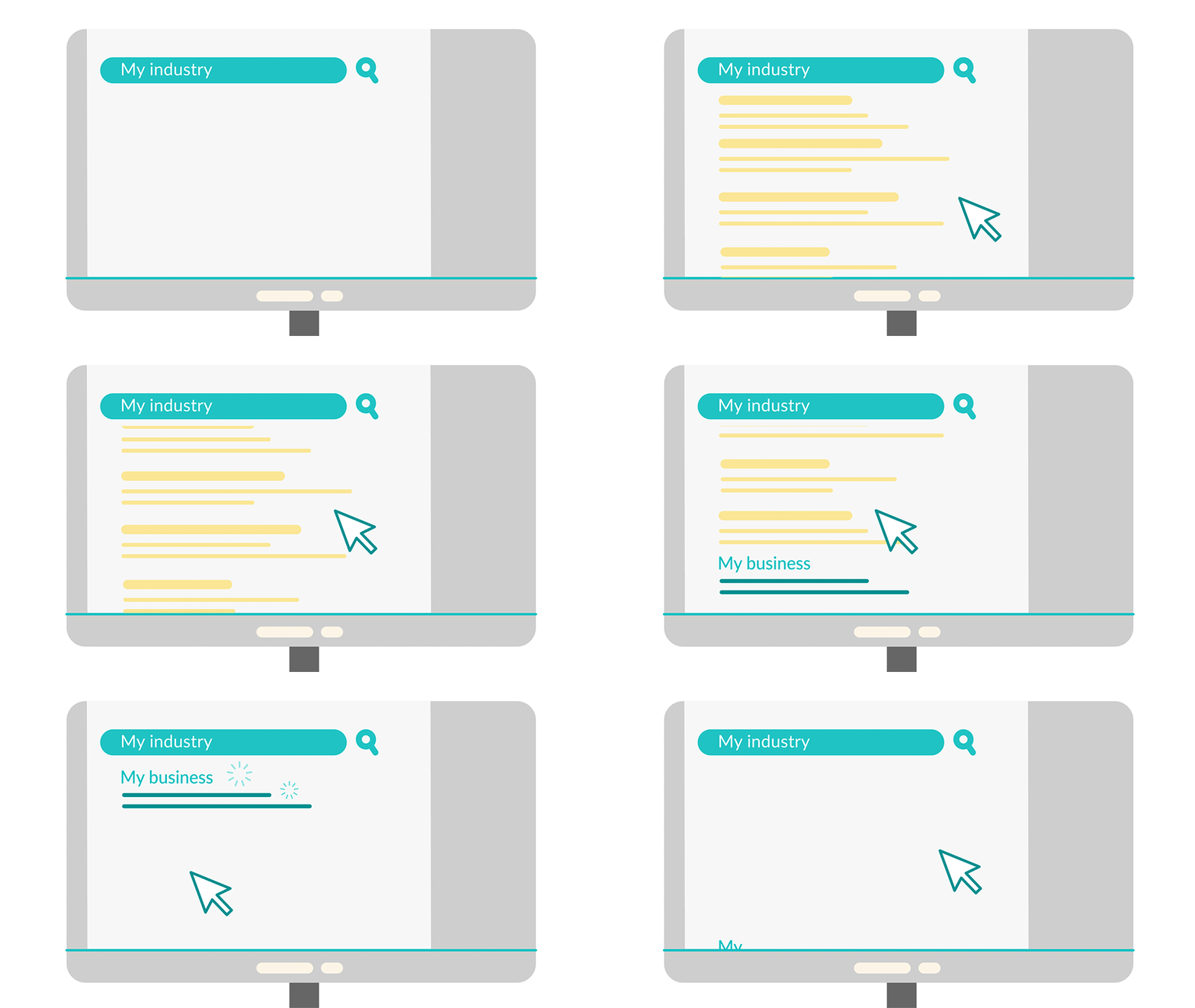
When creating a short 60 second explainer video, it’s important to keep the imagery and messaging clear and easy to understand for the audience. This helps to cement the key messages early on. It also grabs the audience’s attention in the short timeframe you have them for. Through the use of metaphors tying in with stylised versions of UI screens and website rankings, we were able to get across a large amount of messaging to the audience in a clear and effective way. Combining this with the flowing nature of the video from one scene to the next helps to not jar the audience. Additionally, it also keep them engaged from beginning to end.
Another important factor was to get the colour balances right for Signify’s Brand. We didn’t want it to be too washed out with lots of grey. But conversely, we also didn’t want it to go too far on the other end of the spectrum. As this would not represent the polished, professional and premium feel of the brand. On the left you can see multiple versions of some shots with different colour palettes as they developed.
Asset Extraction
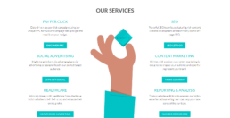
Signify knew that they wanted the video to have more uses than just being on a webpage with a play button. They wanted their brand and website to have more of a cohesive feel if this video was going to summarise who they are and what they do for their customers. The way that this was achieved was through the extraction of assets from within the video content. By doing this, Signify is able to connect their content and give their forward facing presence to their audience one unified feel.
The Result
The final explainer animation for Signify is an effective and bright explainer video that does exactly the job it set out to do. And has fun whilst doing it!
What our client Said
“Producing our first ever animated video was a scary proposition and uncharted territory for us as an agency. Working with The Animation Guys they put us at ease, listened to our ideas and made the process come to life. They’re genuinely decent, honest and hard-working people that ultimately produce first-class animation videos. We couldn’t be happier with our final product and no doubt will return to them for a follow up video at some point! Fully recommend.”
Beth Hellowell
Managing Partner @ Signify Digital

