The Brief
Recently, Alpha Grid, a Financial Times company approached us with an exciting project in mind. They wanted to create a personalised 3D data driven animation for their readers. The concept was to provide insight into their audiences’ reading preferences and how they interacted with the Financial Times app throughout the previous year. Our brief was to create a year-in-review style animation titled ‘The Financial Times Reading Review’. The animation was to highlight readers’ past habits while also recommending content for them to access in the upcoming year all wrapped up in an engaging and data driven 3D animation.
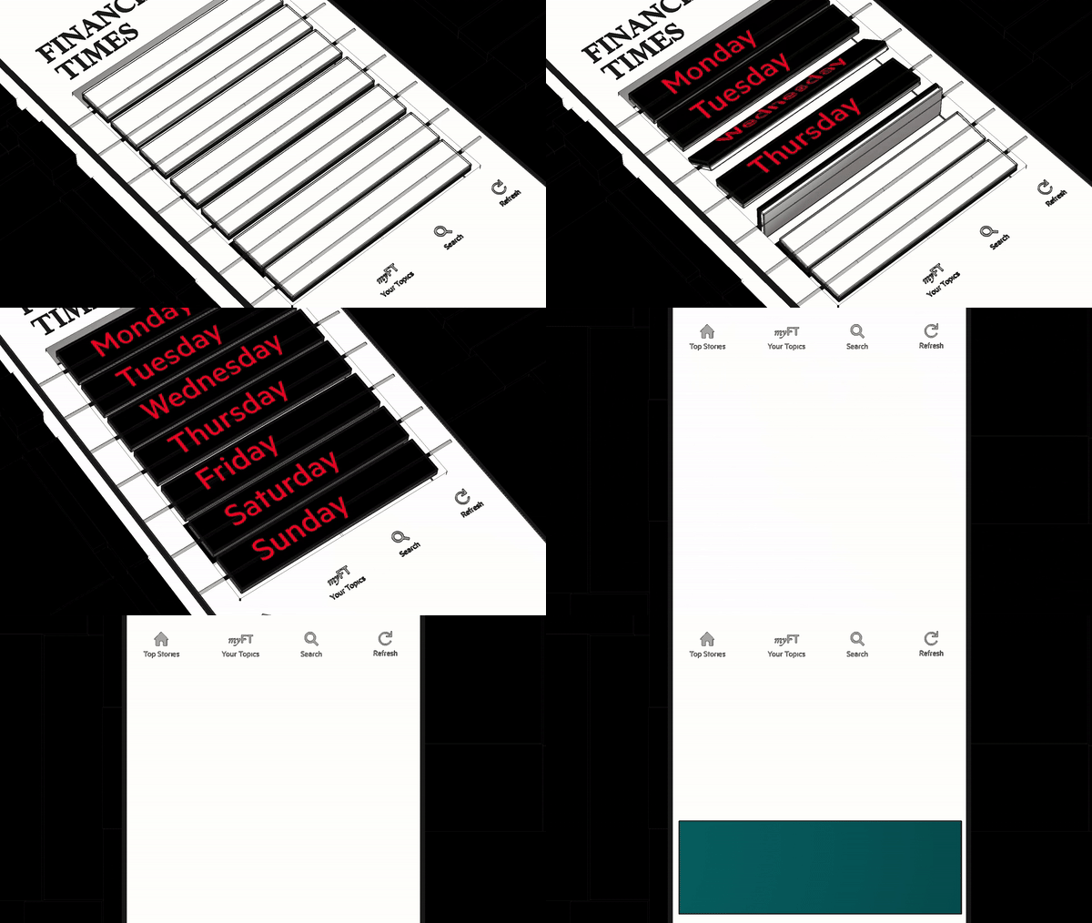
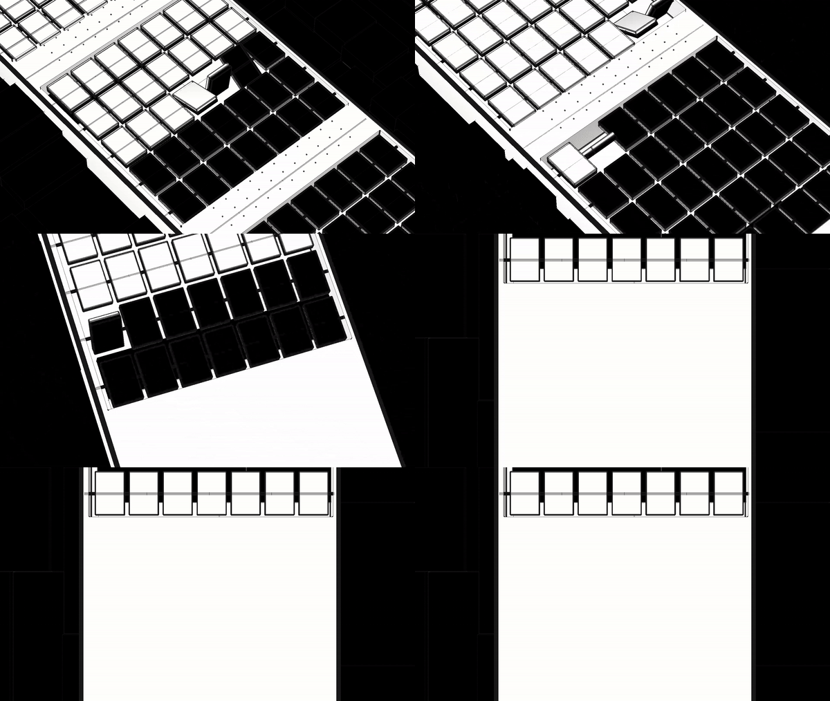
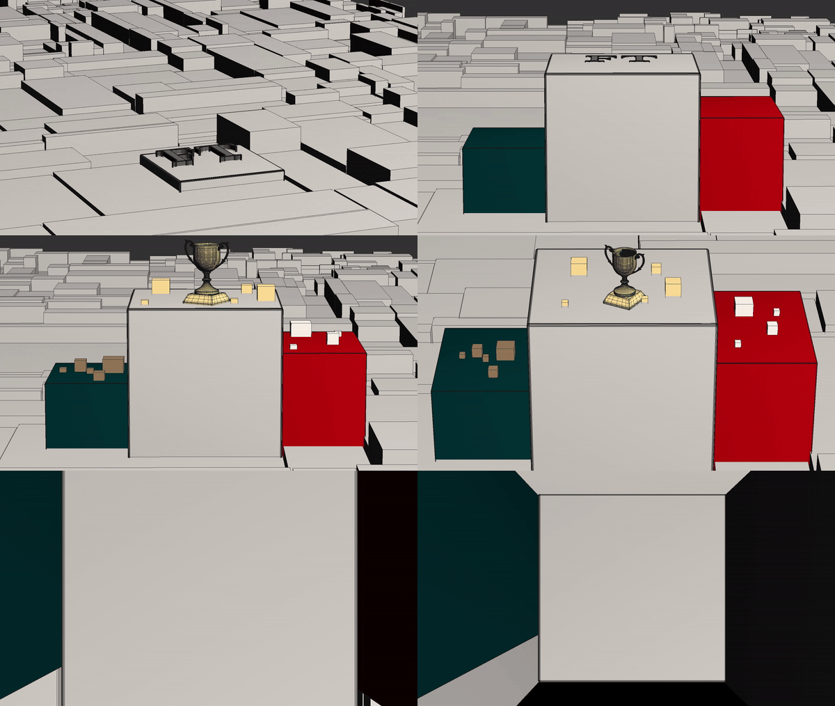
We decided on a building block motif to be the main design theme of the animation. The 3D blocks gave us the foundation to base the narrative and ensure that the data and information was presented in both an informative and visually enchanting way. We believed this would be the ideal way to concisely present each reader’s individual statistics, from the number of articles they have read, to their most followed topics on the app.
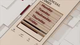
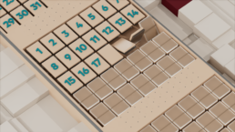
Our approach focused on mixing the square building blocks with other animated elements to create an engaging and personalised experience for each app user. For each piece of data we used a related animated element that helped bring the statistics and feel of the animation to life.
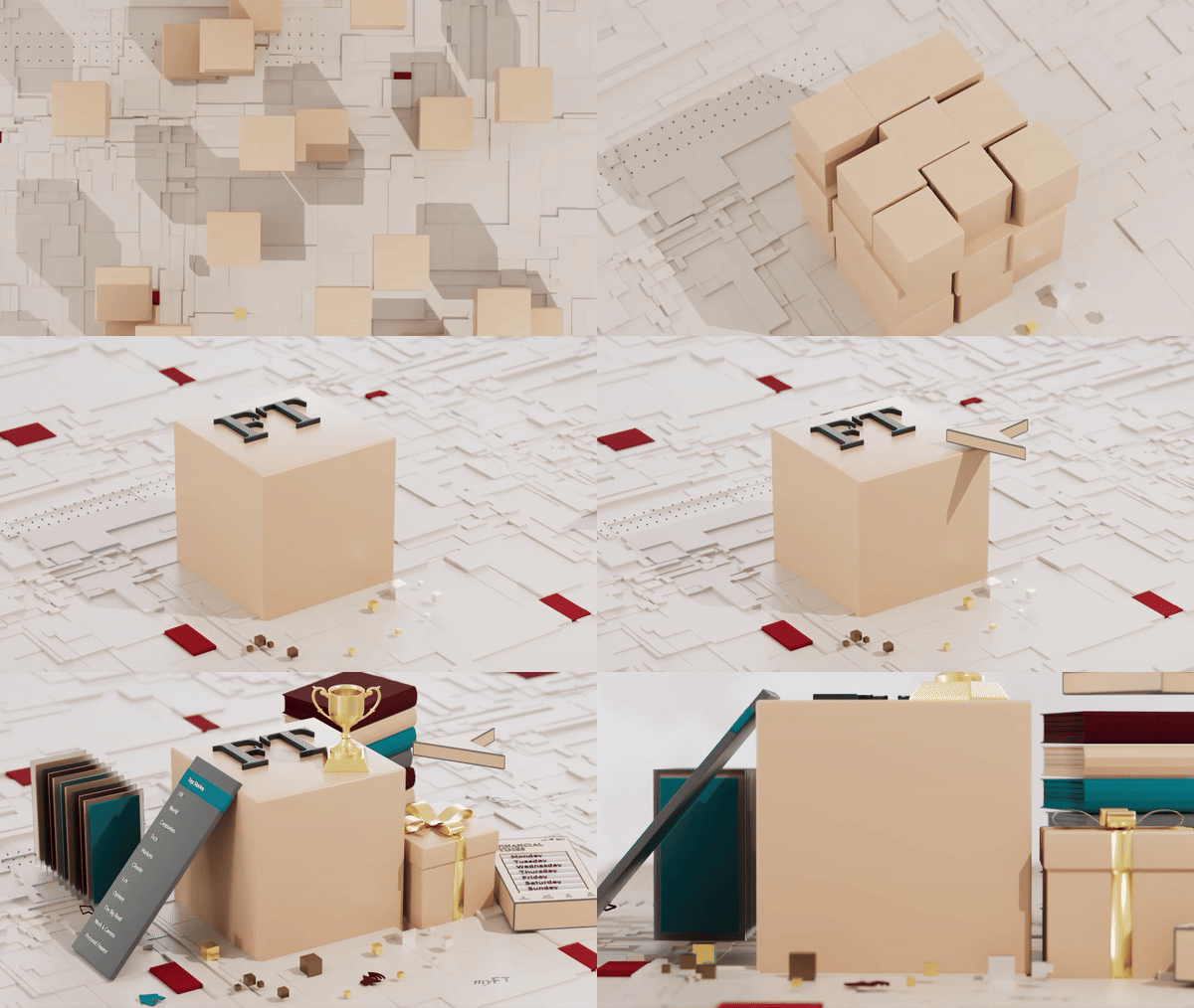
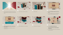
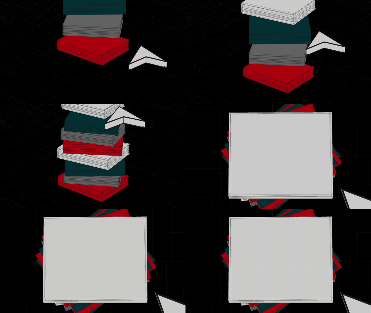
As you can see in the final video we used a stack of 3D animated books to show how a users’ reading has ‘stacked up’ in terms of word count. While a gift box was chosen to reveal the number of articles a person had gifted to their friends.
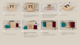
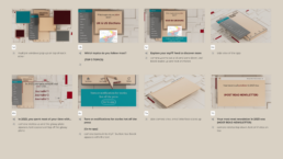
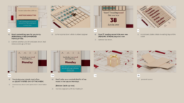
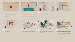
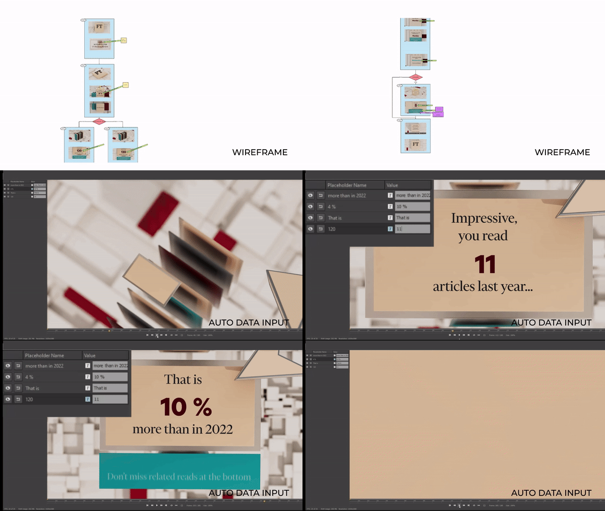
For the initial storyboard we wanted to ensure we fit around the The Financial Times brief of wanting a sleek looking animation that conveyed a variety of information in a short space of time. To create this timing was crucial as well as making sure the 3D visuals flowed seamlessly from one piece of information to the other.
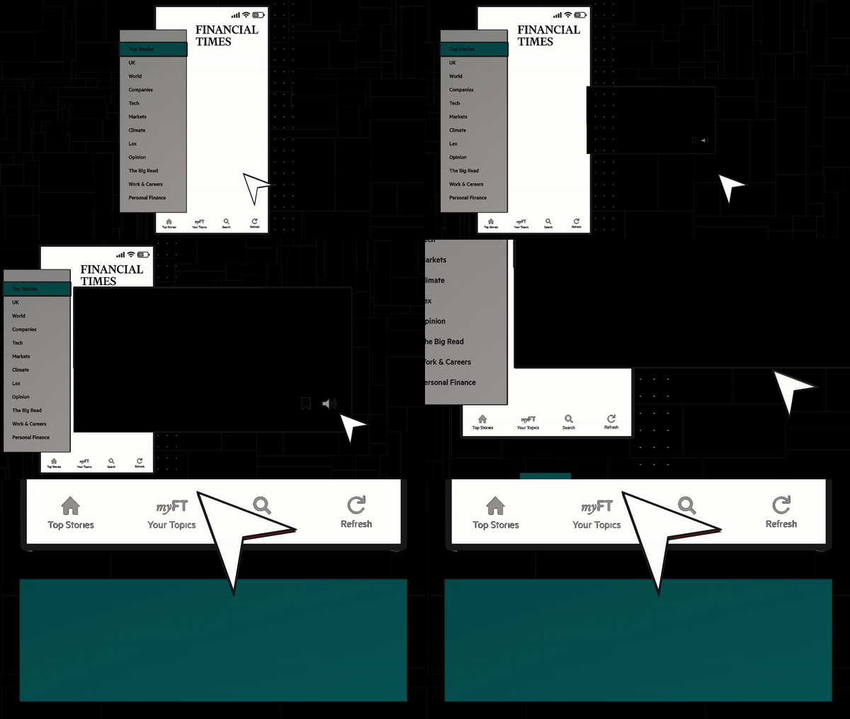
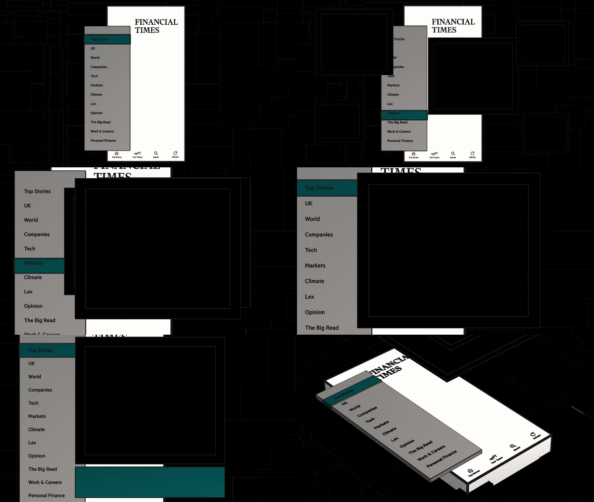
As you can see from the storyboard, we implemented a variety of assets with simple yet elegant text animations to engage viewers as each part of their data was presented. Our main aim was to connect with the audience by displaying their statistics in an exciting, informing and engaging way. To ensure the animation was as dynamic as possible we included fast camera style zooms and transitions to give it a high production feel and make the whole piece flow effortlessly together.
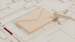
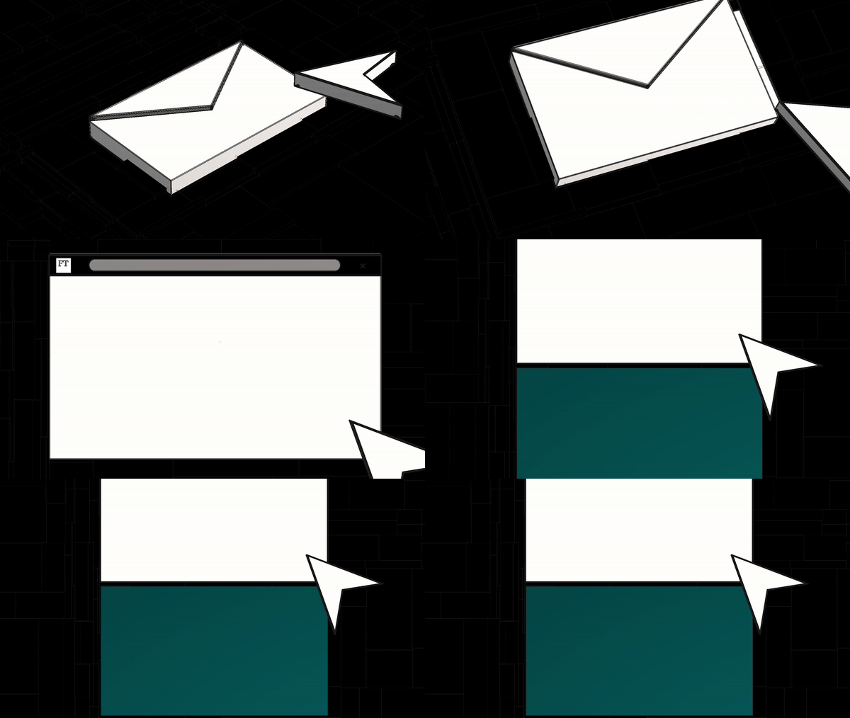
We included 3D elements, such as the mouse cursor, that we used to interact with the assets and transition from each of the different data points displayed within the video. We also added uplifting classical music to complement the tone of the video and appeal to its educated target audience.

