The Importance Of Brand Guidelines On Your Animation Journey
You might think that you’d need a 20-page brand guidelines document to create an animation video. However, here at The Animation Guys, we work with clients big and small and see anything from something as simple as a logo, a few colours and font choice, all the way through to specific measurements for different types of branding and marketing.
Sometimes a new company comes to us and they haven’t yet nailed down their brand guidelines at all. For those people, we are here to help! We can help direct you through the process and create a simple style guide, value proposition and tone sheet specifically for your animated video. We can also consult and work together with you to produce something that communicates your purpose and value.
So, how do you go about creating a set of brand guidelines? And how can we help?
“The code is more what you’d call ‘guidelines’ than actual rules.”
– Captain Barbossa
Creating an animated video with a style guide in place means you will present a consistent logo, colour palette, tone of voice, typeface and overall ‘look’ to the rest of your marketing activity. Brand guidelines encompass your style guide in addition to your wider image as a company. They reflect how you communicate with customers – your mission, values and ethos as a business. Guidelines ensure that every brand animation you produce looks and feels consistent to customers, so they can recognise and remember your company. This builds trust. And trust is what sells products and services!
Many companies choose to outsource the creation of brand guidelines to a branding agency. There are a few reasons to consider this. The first is down to experience. Agencies who create marketing material across a wide range of clients will be able to apply their expertise and inspiration from other projects they’ve worked on. In our case, we’ve worked with hundreds of very different brands to create graphics and videos across a range of subjects. For companies who already have a set of brand and style guidelines in place, we ensure that we discuss and understand these upfront. For those who don’t have anything in place, we chat about how we can work around this and whether they need some help creating a simple set of guidelines to put in place before we get started.
In the early stage of the animation process it’s important to go through and identify what your brand is all about and who the video’s target audience is. This helps to see beyond the pages of the brand guidelines and define an animation style for the video. To build off from a brand’s already established look, designers visualise what is being communicated, what is the content of the video, and most importantly who is going to watch the video.
Below we’ve selected a variety of our latest projects so that you can visualise the translation of a companies brand guidelines into an animated video.

Dr Foster help healthcare organisations make better and faster decisions using data and insight. They came to us needing to show off their new dashboard software and we recommended creating what is called an animated demo video. We took inspiration from their established colour palette, using pink and greys with a combination of angles that mirror the shapes they have on their current website and branding.

In an animated demo video, the focus is the software or product, so the visuals need to compliment & accentuate those. This AR animation for Dr Foster allowed us to pinpoint the main components of their new dashboard software without inundating their audience with too much detailed information. The key was elaborating on their brand guidelines by adapting them to best fit the animated demo style.
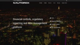
Autorek are a Scottish Fintech company that brought us the interesting challenge of creating a conceptual 3d visualisation, that also managed to capture their key services. This fintech animation video would sit as a background visual on their website, whilst also being split up into additional assets throughout their branding. This added to the challenge as the animations had to fit within a wide area scope.
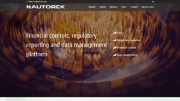
The challenge for us was taking an established brand and expanding that look into something conceptual. We needed to ensure that we represented the wide variety of services that Autorek provides, whilst still staying high concept and bespoke. Ultimately, we had to produce a creative solution to tell a story whilst also maintaining the clients well-established brand guidelines.

Akixi brought us an interesting project that was highlighting their latest dashboard software. Yet for this, we took a different direction. Their target audience meant that a basic corporate style would simply blend into the background. We created characters and a style using simple shapes and colours along with bold black outlines. This fit into their established brand style helping the animation to feel grounded and straightforward like a building block.
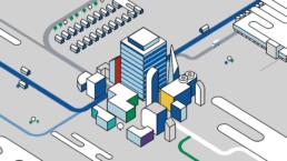
We wanted to avoid the video looking like a ‘tech’ animation as we felt this was in a different style and category with a alternative target audience and message. We decided to go for an isometric animation, by creating it in 3d, matching the 2d look with all sorts of visuals popping up and flipping around. Filling the animation with character and charm and creating something Akixi would be eager to put on their homepage.
Crisis - Heartfelt Charity Character Animation
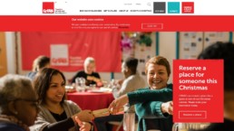
Crisis is the national charity for homeless people. They have a wonderfully strong brand that is easily recognisable. The aim here was to make sure that the animation we produced underpinned their strong brand identity and carried through to a characterful animation. We wanted the video to emotionally engage with the audience and really speak to them about the struggles of being homeless and the great work that crisis does.

We created a variety of characters in varied and difficult situations. We felt like this would help to appeal to a wider, more general audience. To match the aesthetic that Crisis has for their branding we added a texture to the final video that matched the worn look that forms part of the Crisis brand identity.
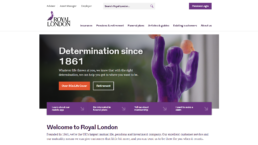
When creating an animated TV advert for the insurance company Royal London, our challenge came with their brand being comprising of mainly one colour, purple! For this type of project, there are many options to consider. Working in collaboration with Radio Ville, we started building out a visual environment that combined depth, visual interest and animation potential while being closely aligned with Royal London’s brand.
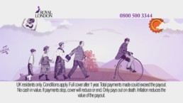
Working closely with Royal London, they brought us a finished script with an established Victorian style to it. It was our job to make this style fit as closely as possible with their brand guidelines and have the charm of old Victorian puppet theatre! It ended up airing to over 100 different TV stations for an extended amount of time, showing that if done correctly, an animated video can stick with a brands changing image across multiple years.
Devyser - Medical Animation

Devyser are specialists in diagnostic kits for complex DNA testing. We created a scientific explainer video for their new testing method. It was imperative that the video we created communicated the information and methods accurately and clearly to fit with the detail and precise methods incorporated in the work that is undertaken. The animation video needed to portray these visually complex ideas and steps just as precisely as the real thing. However, this type of thinking can lead to creating something sterile and inauthentic for the final video….
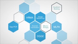
It was important to make sure that there was a balance between engaging visual design and animation and accurately conveying the scientific information. Using Devyser’s brand guidelines we brought together the key aspects of their method and displayed them in a way that would fit within their previously established look, whilst also being new and visually engaging.
Regardless of the size of your brand guidelines, or the scope of the project you want to create, we are experts in translating and developing your brand into something new, successful and wonderful. This may be creating characters that are unique to your company, styling animations to fit seamlessly into your already existing content, and even producing something weird and wacky that still feels like it is uniquely yours.
Many companies choose to outsource the creation of brand guidelines to a branding agency. There are a few reasons to consider this. The first is down to experience. Agencies who create Marketing material across a wide range of clients will be able to apply their expertise and inspiration from other projects they’ve worked on. In our case, we’ve worked with hundreds of very different brands to create graphics and videos across a range of subjects. For companies who already have a set of brand and style guidelines in place, we ensure that we discuss and understand these upfront. For those who don’t have anything in place, we chat about how we can work around this and whether they need some help creating a simple set of guidelines to put in place before we get started.

It’s definitely worth agreeing style components such as how your logo should be used, your preferred font, your tone of voice and a colour palette for your animated video. These simple selections can begin to form the basis of your brand guidelines, so it’s a useful process to go through!
Once we’ve agreed your style guidelines, we’ll discuss your brand and how you want customers to think, feel and act when they see your animated video. We’ll begin to build out a storyboard for your animated video. This is a series of scenes that will eventually link together to become your animated video. The beauty of having brand guidelines already in place is that we will have a set of pre-agreed rules to apply to your video, which can speed up the storyboarding process.
Once you’ve approved your storyboard, we’ll then move into artwork and create the animation for your video. You’ll have the opportunity to check your animated video, ensure it adheres to your brand guidelines and approve the final product before it is produced. We can also help with guidance and advice for helping you share your video across all the appropriate marketing channels.
If we’ve helped you create a set of style or brand guidelines for your animated video, we’ll package these up in a document. You can then share these with anyone who is responsible for creating other marketing activity for your company in the future. You can use the same design elements and tone of voice across all your marketing channels – and this will go a long way towards strengthening your brand and making it memorable!
If you’d like to find out more about creating an animated video, with or without brand guidelines in place, do get in touch! Call us on 0207 2886 319 and let’s discuss your brand, objectives and how we can help you.
Share this bite
The Animation Video Workbook

The 1-stop shop for everything you need to know about making the most awesome video possible


